Getting it off to a T?

Collapse
X
 
  • Filter
  • Time
  • Show
Clear All
new posts
  • LeMartinPecheur
    Full Member
    • Apr 2007
    • 4717

    Getting it off to a T?

    I distinctly remember being taught as a child that lower-case letters were either 'big' or 'small/ little'. Why then are printed lower-case T's commonly, though not universally, intermediate in height between small letters and L's, for example?

    This is true on this forum, as 'bdfhlkltalta' shows. On my screen anyway, and hopefully on yours!

    In some typefaces there is scarcely any height difference between l-c T's and 'smalls' at all. Is this an added problem for dyslexia sufferers I wonder?
    Last edited by LeMartinPecheur; 19-02-21, 14:26.
    I keep hitting the Escape key, but I'm still here!
  • eighthobstruction
    Full Member
    • Nov 2010
    • 6225

    #2
    indeed....if i have a spare moment i will get my micrometer out and guage this anomaly

    ....at least emogies on this forum are well sized....on Facebook they are indcipherable....often....
    bong ching

    Comment

    • kernelbogey
      Full Member
      • Nov 2010
      • 5552

      #3
      Every type face will have been individualy designed. In the example you use, note that that the horizontal stroke of the t aligns with the top of the a, and with the lower parts of b, d, h, and k.

      Typeface designers aim for a pleasing look which will also guide the eye along nicely - and in any case we read most words whole.

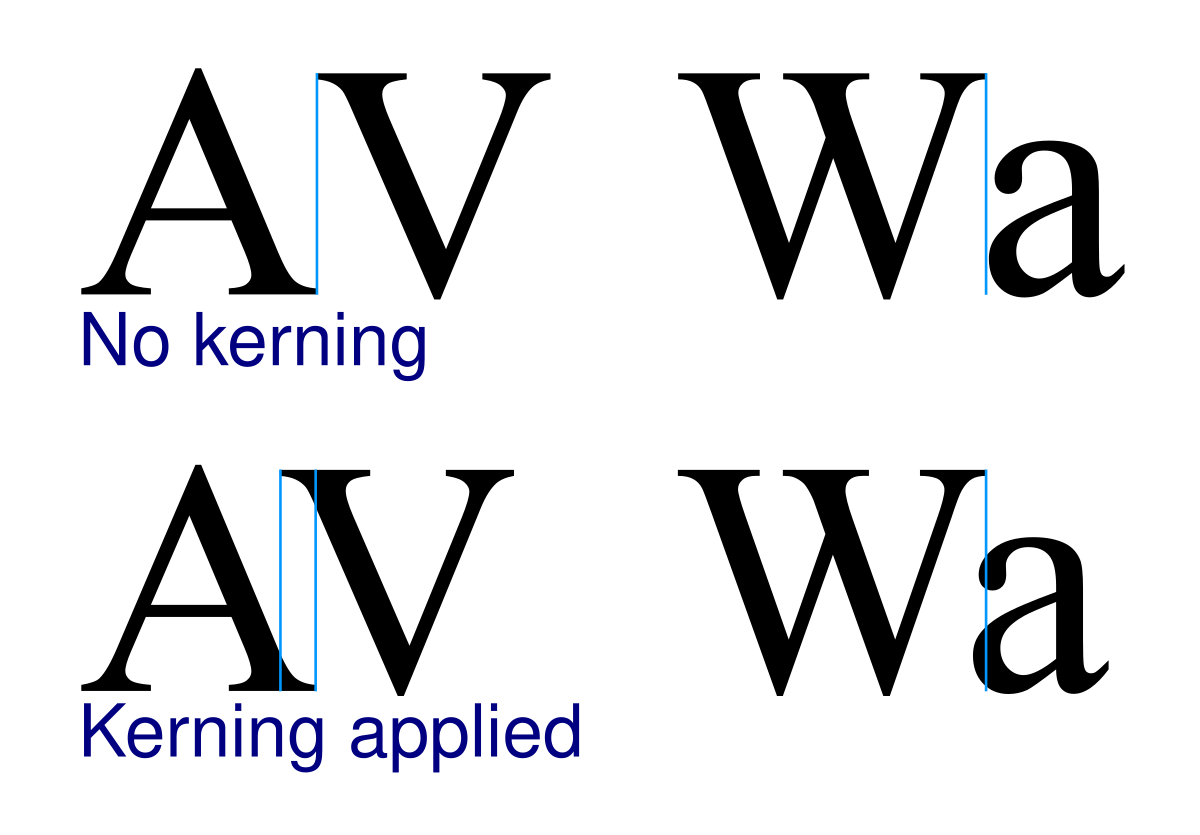
      Spacing between letters is also not consistent. I remember beng taught at school when we did a term on lettering and calligraphy, that a capital A has naturally so much space around it that you must place the next letter, in most cases, closer to it than for other captals (say I).

      If you were to spend a happy morning printing out 'Quick brown fox' sentences in a variety of the many typefaces your computer surely provides, other variables would no doubt come to light.

      PS @ LMP: I take it that the Escape key has now worked?

      Comment

      • Pulcinella
        Host
        • Feb 2014
        • 10244

        #4
        At the top of each page that starts a new letter in Chambers, there is a capital and lower-case letter of a font whose name starts with that letter, then a row of the 26 lower-case letters in that font: a nice touch.

        Comment

        • vinteuil
          Full Member
          • Nov 2010
          • 12471

          #5
          .

          ... the lower case t, usually taller than the small letters but not usually as tall as the high risers, has been a characteristic of lettering since at least the days of Aldus Manutius, Francesco Griffo, and Nicolas Jenson


          Originally posted by kernelbogey View Post

          Spacing between letters is also not consistent. I remember being taught at school when we did a term on lettering and calligraphy, that a capital A has naturally so much space around it that you must place the next letter, in most cases, closer to it than for other capitals (say I).
          :
          ... yes - this is called the art of kerning -


          .

          Comment

          • kernelbogey
            Full Member
            • Nov 2010
            • 5552

            #6
            Originally posted by vinteuil View Post
            .
            ... yes - this is called the art of kerning -

            https://en.wikipedia.org/wiki/Kerning
            I am of course particularly fond of a 'well-kerned font'.

            Comment

            • LeMartinPecheur
              Full Member
              • Apr 2007
              • 4717

              #7
              Originally posted by kernelbogey View Post
              Every type face will have been individually designed. In the example you use, note that that the horizontal stroke of the t aligns with the top of the a, and with the lower parts of b, d, h, and k.

              Typeface designers aim for a pleasing look which will also guide the eye along nicely - and in any case we read most words whole.
              Thanks kernel, but it just prompts further questions! Why is it just the letter t that doesn't follow the 'rule' I learnt as a child? Did some twisted genius of a typeface designer just decide to make his small T's intermediate in size in order to be different? If so when? And did the rest of the world (most of) just follow the new fashion like sheep?

              Perhaps these are questions that simply have no answer. Wiki seems to be silent on the subject.

              Re ongoing failure of Escape key, see PM!

              PS Thanks vinteuil for dating the historical precedents. I shall worry less about it now
              I keep hitting the Escape key, but I'm still here!

              Comment

              • Serial_Apologist
                Full Member
                • Dec 2010
                • 36834

                #8
                Originally posted by LeMartinPecheur View Post
                I distinctly remember being taught as a child that lower-case letters were either 'big' or 'small/ little'. Why then are printed lower-case T's commonly, though not universally, intermediate in height between small letters and L's, for example?

                This is true on this forum, as 'bdfhlkltalta' shows. On my screen anyway, and hopefully on yours!

                In some typefaces there is scarcely any height difference between l-c T's and 'smalls' at all. Is this an added problem for dyslexia sufferers I wonder?
                Compression.

                Comment

                • vinteuil
                  Full Member
                  • Nov 2010
                  • 12471

                  #9
                  Originally posted by LeMartinPecheur View Post
                  Wiki seems to be silent on the subject.
                  ... this may be of use -


                  It all dates back to the designing of letter forms in the fifteenth century, derived, as far as lower-case is concerned, from carolingian minuscule.

                  I think the 'rule' you were taught at school was insufficiently detailed

                  .

                  Comment

                  • Roslynmuse
                    Full Member
                    • Jul 2011
                    • 1226

                    #10
                    Originally posted by Zucchini
                    'bdfhlkltalta'
                    [/QUOTE]

                    How did you guess my forum password?

                    Comment

                    • LeMartinPecheur
                      Full Member
                      • Apr 2007
                      • 4717

                      #11
                      Originally posted by LeMartinPecheur View Post
                      Re ongoing failure of Escape key, see PM!
                      Kernel, I tried to PM you but got told I couldn't because your storage is overfull.
                      I keep hitting the Escape key, but I'm still here!

                      Comment

                      • french frank
                        Administrator/Moderator
                        • Feb 2007
                        • 29499

                        #12
                        Originally posted by vinteuil View Post
                        ... this may be of use -


                        It all dates back to the designing of letter forms in the fifteenth century, derived, as far as lower-case is concerned, from carolingian minuscule.
                        Some useful images there. I was just looking through my copy of A Book of Scripts and the letter Tt shows a great deal of variation. In some scripts there seems to be no difference between the shape of the upper and lower case forms. So T and T. A lower case 'curly t' is just a c with a sort of tilde across the top, no ascender at all, or just like a modern lower case t in shape but exactly the same height as the other lower case letters without ascenders.

                        PS This refers to written scripts rather than printed, but I presume the designers of fonts followed similar practices.
                        It isn't given us to know those rare moments when people are wide open and the lightest touch can wither or heal. A moment too late and we can never reach them any more in this world.

                        Comment

                        • LeMartinPecheur
                          Full Member
                          • Apr 2007
                          • 4717

                          #13
                          Originally posted by vinteuil View Post
                          I think the 'rule' you were taught at school was insufficiently detailed.
                          Not sure I agree! It was quite detailed enough for infant-school handwriting lessons, but I take your point now I've moved up from there
                          I keep hitting the Escape key, but I'm still here!

                          Comment

                          Working...
                          X